New pages, without sending every one back to a developer
TeamBuilder sells staff and space scheduling software to ambulatory care groups. Its old site was hard to find in search and hard to change.
The marketing team needed to keep producing pages after launch: product pages, partner pages, campaign pages, news. The goal was to open a template, drop in sections, fill in content, publish, and still match the design.
An audit first, so the rebuild fixes what search engines saw
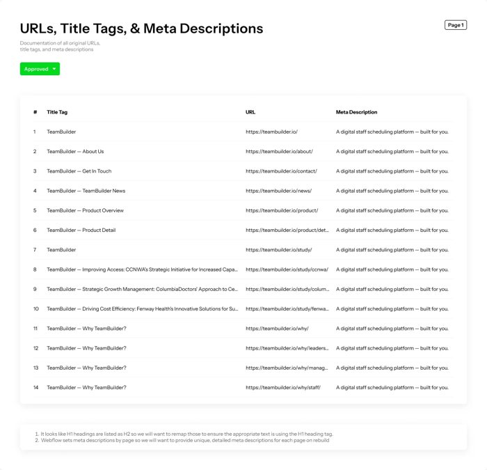
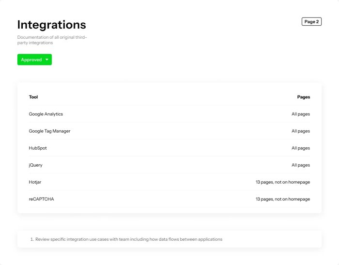
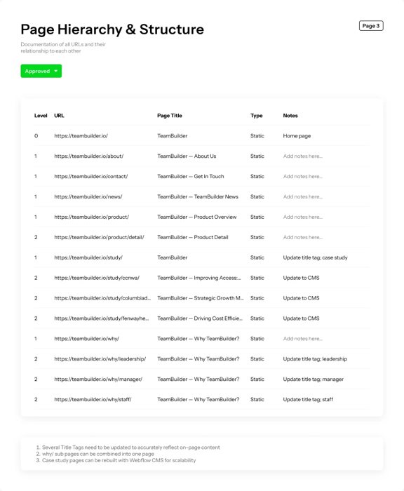
Before designing anything, I documented the old site: every URL, title tag and meta description, its third‑party scripts, page hierarchy and canonical tags, plus a baseline SEO report. Each document was approved before the rebuild started, and each finding became a requirement.
| Found in the audit | In the rebuild |
|---|---|
| All 14 pages shared one meta description. | Every page has its own title and description, written for the people TeamBuilder sells to. |
| Four “Why” pages had the same title, and the case study index was titled just “TeamBuilder”. | Titles describe the page, like “Client Stories | TeamBuilder Success Cases”. |
| Page headings were tagged H2, so pages had no H1. | Headings start at H1, and every component sets its own heading level. |
| No sitemap.xml. | A sitemap lists all 20 public URLs. |
| Case studies were hand-built pages. | Stories is a CMS collection with one template. |
| Mobile pages took 7.7 seconds to load, against 1.06 on desktop. | Images run through Webflow’s responsive image handling, so phones get smaller files. |
Findings from the approved audit, and where each one landed.
A new structure
The audit also fed a new site map. Four overlapping “Why” pages folded into one product overview, and stories, news, partners, thought leadership and videos each became a section of their own, most of them run from the CMS. Every old URL was mapped to its new address, with 301 redirects where it moved.
 01URLs, titles and meta
 02Integrations
 03Page hierarchy
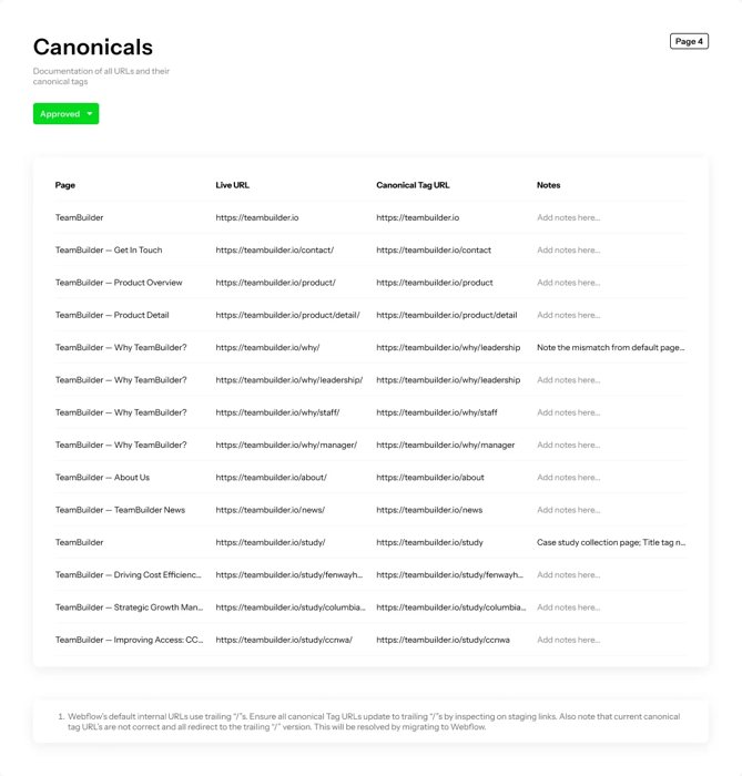 04Canonicals
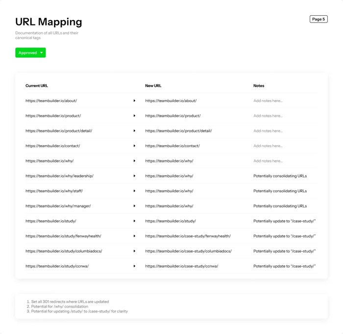 05URL mapping
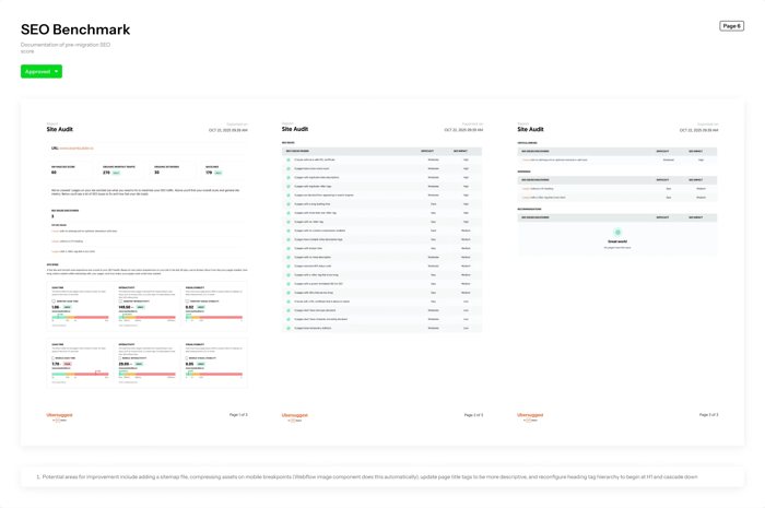 06SEO benchmark
The product leads, with people kept in the picture
Real scheduling screens sit in nearly every section, set against TeamBuilder’s navy and bright blue, with photography of clinic staff and a few illustrations to keep it human.

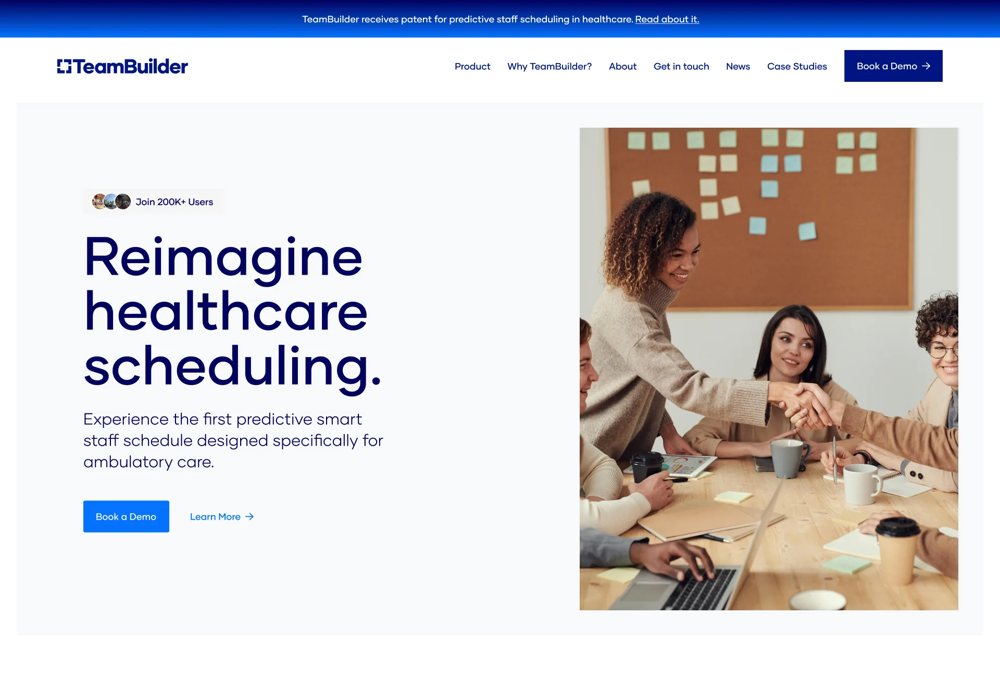

Hero directions from the Figma file. The blue mosaic carried into the build.
Components that expose only what a marketer should change
The design is broken into sections and base components. Each exposes properties for text, images, buttons and the heading level, and hides everything else. A card placed under an H2 can be set to H3, so the page outline stays correct.
Color changes in one place
Color and type come from variables in two layers. Base values hold the raw color scales, and tokens like Brand Dark or Link Primary point at them.
Content that feeds itself
News, videos, stories, thought leadership and partners are CMS collections, and sections pull from them directly. Featuring a news story puts it in the callout on the home page.
| Component | Type | Used | Properties the editor sees |
|---|---|---|---|
| Fact Card | Base component | ×16 | Icon (image, with guidance), header text, header tag level, description |
| Accordion Item | Base component | ×8 | Icon (image, with guidance), heading text, heading tag level, description |
| CTA | Section | ×5 | Header text, header tag level, description, show or hide buttons one and two, button text and link |
| News Callout | Section, CMS | ×1 | No properties. Edited once, updates everywhere. |
| Logo Carousel | Section, CMS | ×1 | No properties. Edited once, updates everywhere. |
| Navigation and Footer | Utility | ×12 | No properties. Edited once, updates everywhere. |
Components read from the Webflow project, with how often each is used across the site.